install.packages("scico")Plotting and manipulating spatial data
In this tutorial, we will go through some of harp’s plotting functions for gridded data with most of our focus on harp’s ggplot geoms geom_georaster(), geom_geocontour() and geom_geocontour_filled(). We will also explore the geo_* family of functions for doing geographic transformations of georeferenced grids.
We are also going to make use of the scico package for some nice colour palettes. If you don’t have it, you can install it with
Simple plotting of 2d fields
For a quick look at a geofield the function plot_field() can be used. If you just want to see what domain the data are on, you can use plot_domain().
library(harp)
library(here)
library(dplyr)
library(forcats)
library(scico)
We’re going to be reading some data from MET Norway’s archive of IFSENS data (for a cutout over Ireland). This file requires some special options for reading the NetCDF that we can saved to a variable.
opts <- netcdf_opts("met_norway_ifsens")

t2m <- read_grid(
  here("data/netcdf/ifsens/ifsens_20240219T000000Z.nc"),
  "t2m",
  lead_time = 6,
  members = 1,
  file_format_opts = opts
)
For plot_field() the title is derived from some attributes of the geofield, some of which aren’t always there.
plot_field(t2m)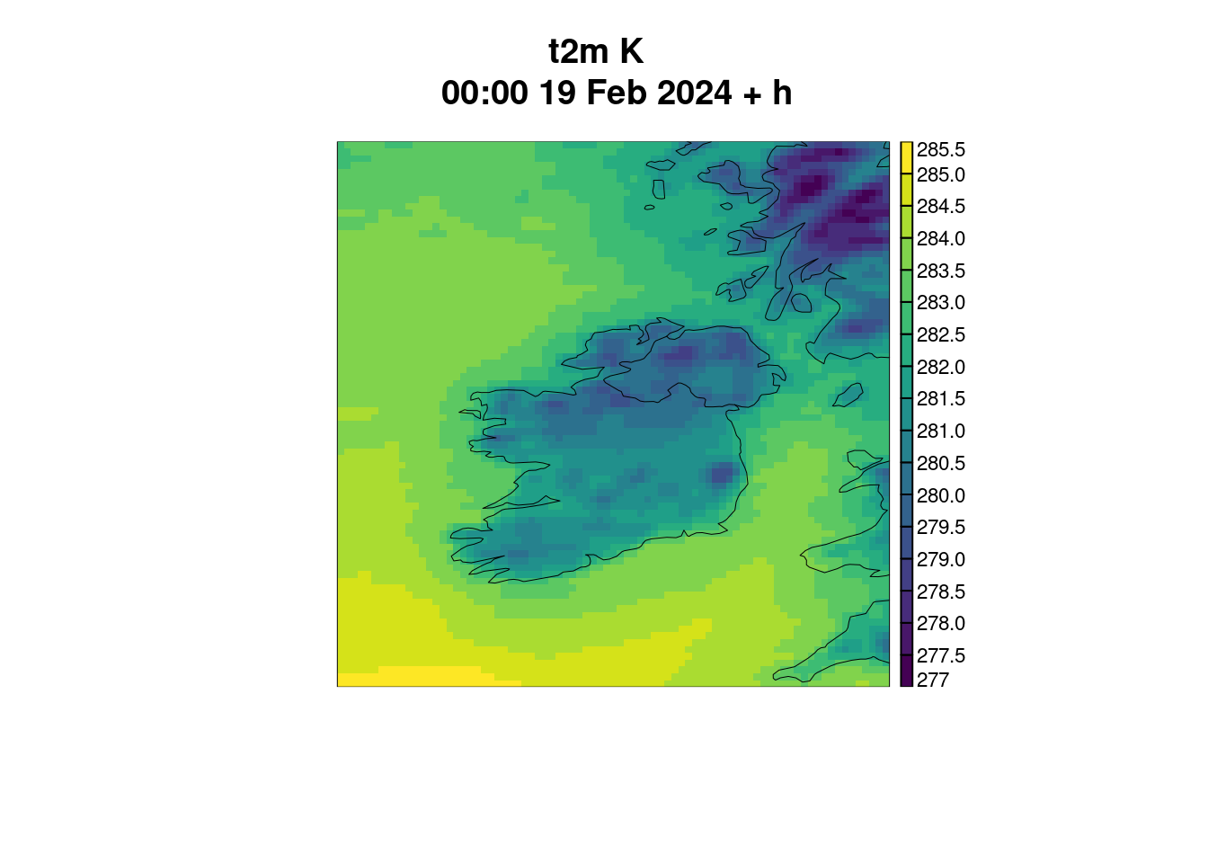
We can do some simple things like change the colour palette, change the breaks and chamnge the title. Here we could use one of the scico colour palettes. You can check them out with
scico_palette_show()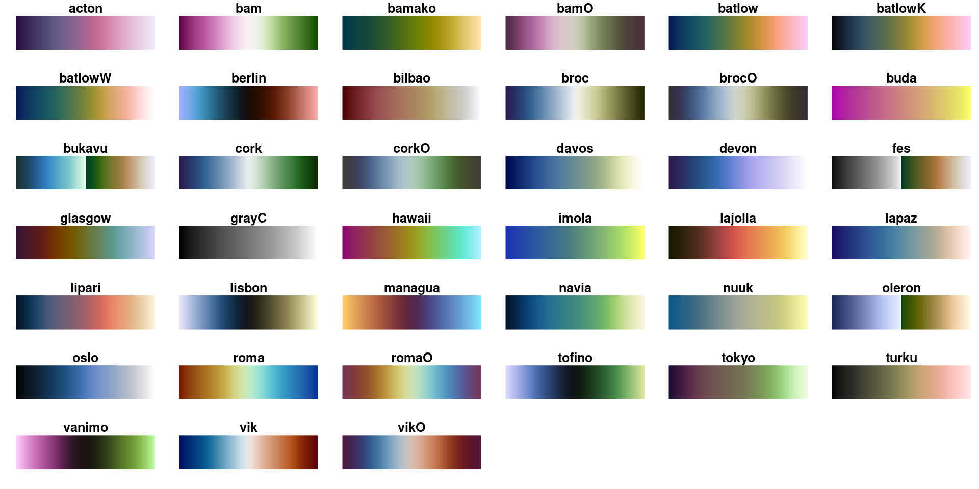
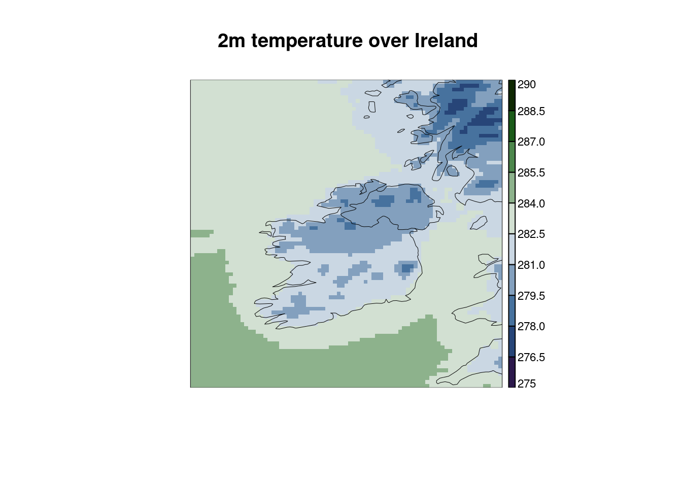
It’s not really the correct colour palette for these data, but when in Ireland…
plot_field(
  t2m,
  palette = scico(256, palette = "cork"),
  breaks  = seq(275, 290, 1.5),
  title = "2m temperature over Ireland"
)
To just plot the domain without any data, you can use plot_domain()
plot_domain(t2m)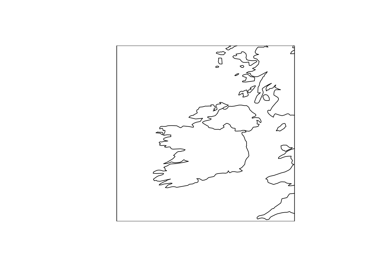
Plotting 2d fields with ggplot
It is also possible to plot 2d fields with ggplot. Here we will use harp specific geoms geom_georaster(), geom_geocontour() and geom_geocontour_filled(). For an explanation of what geoms are and a comprehensive introduction to ggplot as well as the terminology used in building plots with ggplot, you are referred to the Visualize chapter of R for Data Science.
ggplot always requires the data to be in a data frame, and uses the aes() function to map data frame columns to aesthetics of the plot. That is to say, which columns affect how a particular geom is drawn. Plot geoms typically have some required aesthetics and optional aesthetics. In the case of the geom_geo functions a geolist column is always required. This is probably best illustrated with an example. We will read all of the data for 2m temperature in as a data frame using read_forecast(). A quick way to do this if you know the file name is to set the file_template as the file name.
t2m <- read_forecast(
  20240219,
  "ifsens",
  "t2m",
  file_path        = here("data", "netcdf", "ifsens"),
  file_template    = "ifsens_20240219T000000Z.nc",
  file_format_opts = opts,
  return_data      = TRUE
) |>
  scale_param(-273.15, "degC")
We can now try and plot the data for member 0 using ggplot() and geom_georaster().
ggplot(t2m, aes(geofield = ifsens_mbr000)) +
  geom_georaster()
Warning: Computation failed in `stat_georaster()`.
Caused by error in `compute_panel()`:
! More than one geofield in data. Use facet_wrap or facet_grid, or filter data before plotting.
Here ggplot() doesn’t know how to print multiple geofields unless you tell it how to do so. Let’s make things a little easier by filtering the data to only be for lead_time = 6, and extracting member 0 as deterministic.
tt <- filter(as_det(t2m, 0), lead_time == 6)So since it is now deterministic, the column we want to plot is fcst.
ggplot(tt, aes(geofield = fcst)) +
  geom_georaster()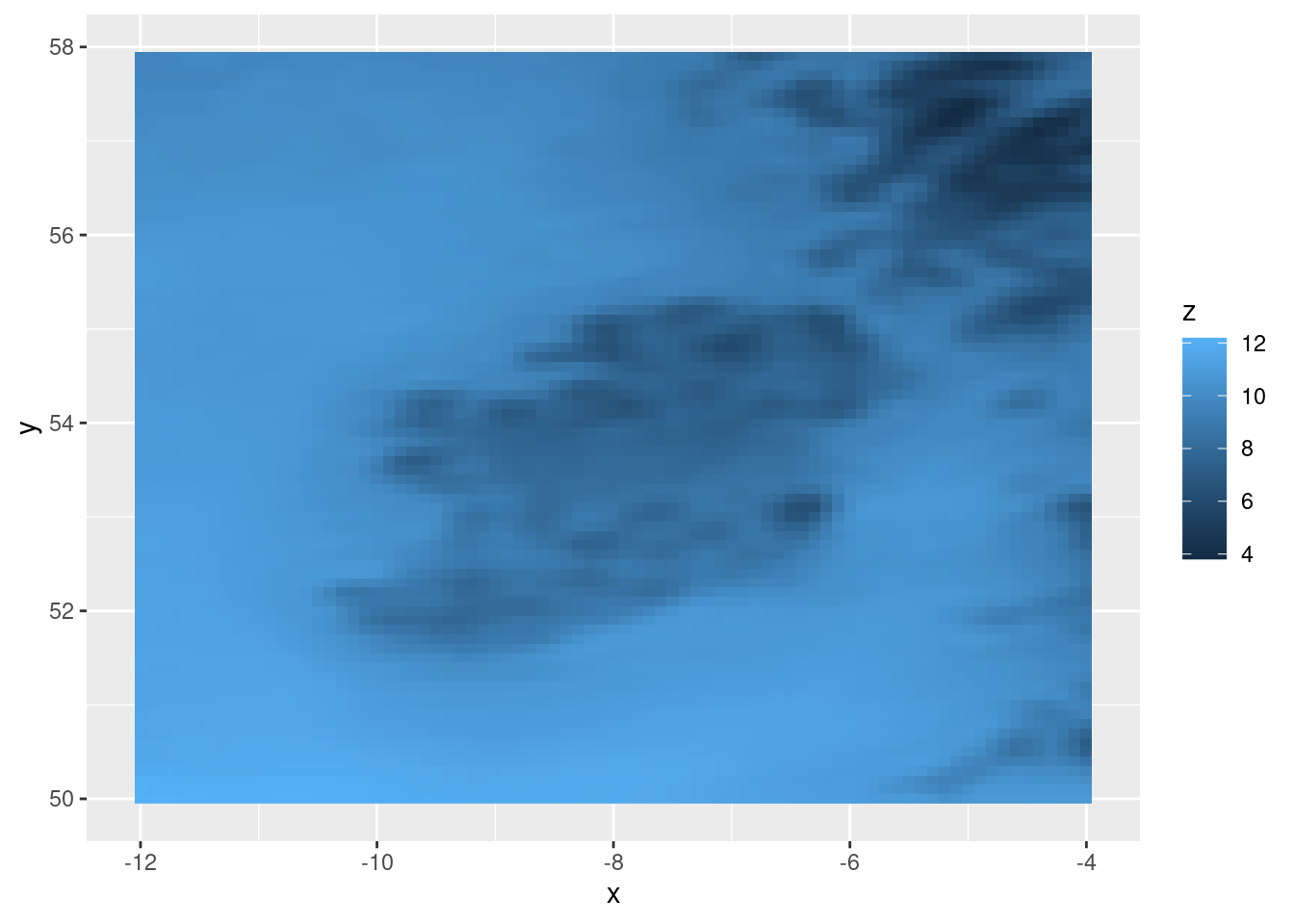
There are a few ways we can improve the plot. Firstly for these data we probably don’t want the expansion zone around the data in the plot panel. We may also want (although this is lat-lon so might not be sensible) to set equal coordinate aspect ratio. We can do all of this with coord_equal(expand = FALSE).
ggplot(tt, aes(geofield = fcst)) +
  geom_georaster() +
  coord_equal(expand = FALSE)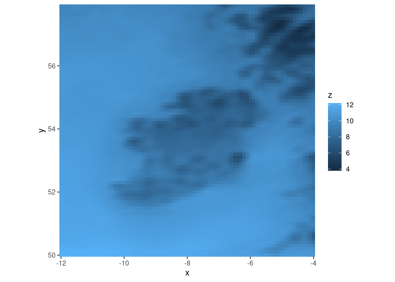
In addition, the tick marks and axis labels aren’t actually much use here, so we can get rid of those with theme_harp_map()
ggplot(tt, aes(geofield = fcst)) +
  geom_georaster() +
  coord_equal(expand = FALSE) +
  theme_harp_map()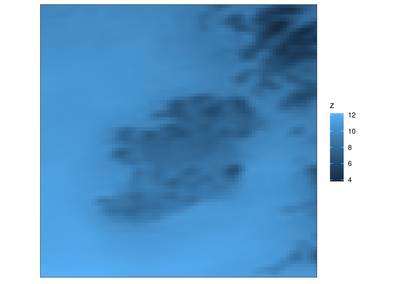
It might also be useful to have a map outline. We can get a map with get_map() telling it which column for which to get the domain for the map. We will also set polygon = FALSE so we only get paths.
map <- get_map(tt, col = fcst, polygon = FALSE)We can now add the map to the plot with geom_path(). Since the geoms use different data and aesthetics we will set those locally for each geom rather than globally for the plot.
ggplot() +
  geom_georaster(aes(geofield = fcst), tt) +
  geom_path(aes(x, y), map, colour = "grey30") +
  coord_equal(expand = FALSE) +
  theme_harp_map()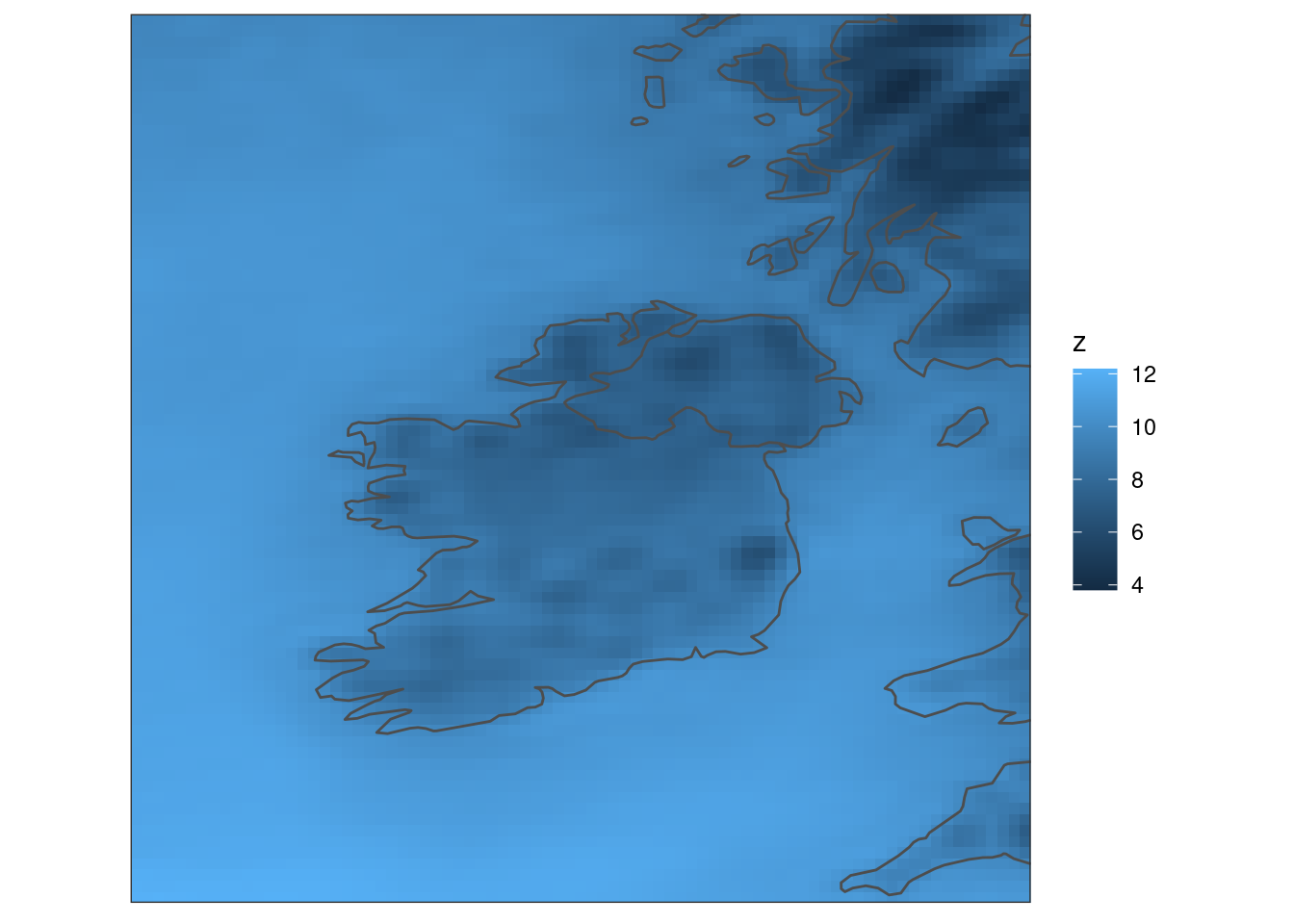
We can get higher resolution maps with the rnaturalearth packages, which can be installed with
install.packages("rnaturalearth")
install.packages("rnaturalearthdata")
remotes::install_github("ropensci/rnaturalearthhires")
To use these packages with get_map() we need a development version of the maps package.
remotes::install_github("adeckmyn/maps", "sf")We can then get a high resolution map with (for example)
map <- get_map(
  tt, col = fcst, map = rnaturalearthhires::countries10, polygon = FALSE
)
Colour scales
We could also change the colour scale. Since this we can use the scale_fill_gradient() functions, scale_fill_viridis_c(), scale_fill_distiller(), or scale_fill_scico(). Here we will demonstrate some of these functions.
ggplot() +
  geom_georaster(aes(geofield = fcst), tt) +
  geom_path(aes(x, y), map, colour = "grey30") +
  scale_fill_gradient(low = "yellow", high = "red") +
  coord_equal(expand = FALSE) +
  theme_harp_map()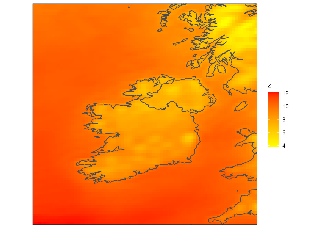
ggplot() +
  geom_georaster(aes(geofield = fcst), tt) +
  geom_path(aes(x, y), map, colour = "grey30") +
  scale_fill_gradient2(low = "blue", high = "red", mid = "white", midpoint = 6) +
  coord_equal(expand = FALSE) +
  theme_harp_map()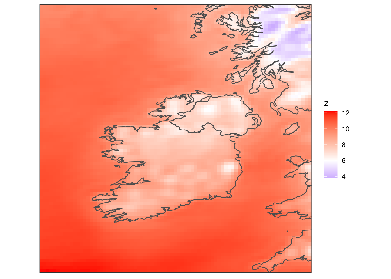
ggplot() +
  geom_georaster(aes(geofield = fcst), tt) +
  geom_path(aes(x, y), map, colour = "grey30") +
  scale_fill_gradientn(colours = heat.colors(256)) +
  coord_equal(expand = FALSE) +
  theme_harp_map()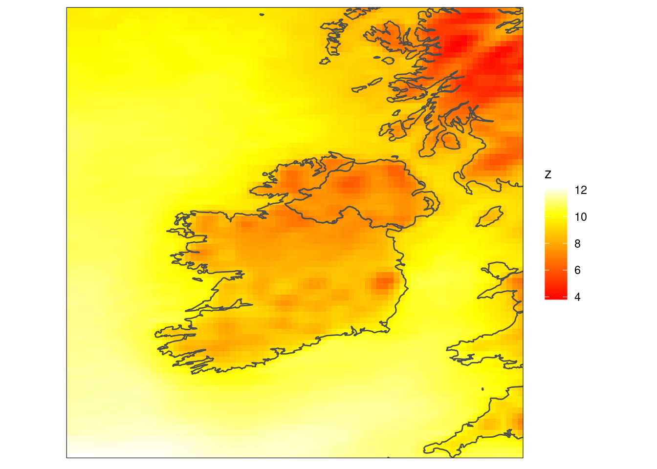
ggplot() +
  geom_georaster(aes(geofield = fcst), tt) +
  geom_path(aes(x, y), map, colour = "grey30") +
  scale_fill_viridis_c(option = "B") +
  coord_equal(expand = FALSE) +
  theme_harp_map()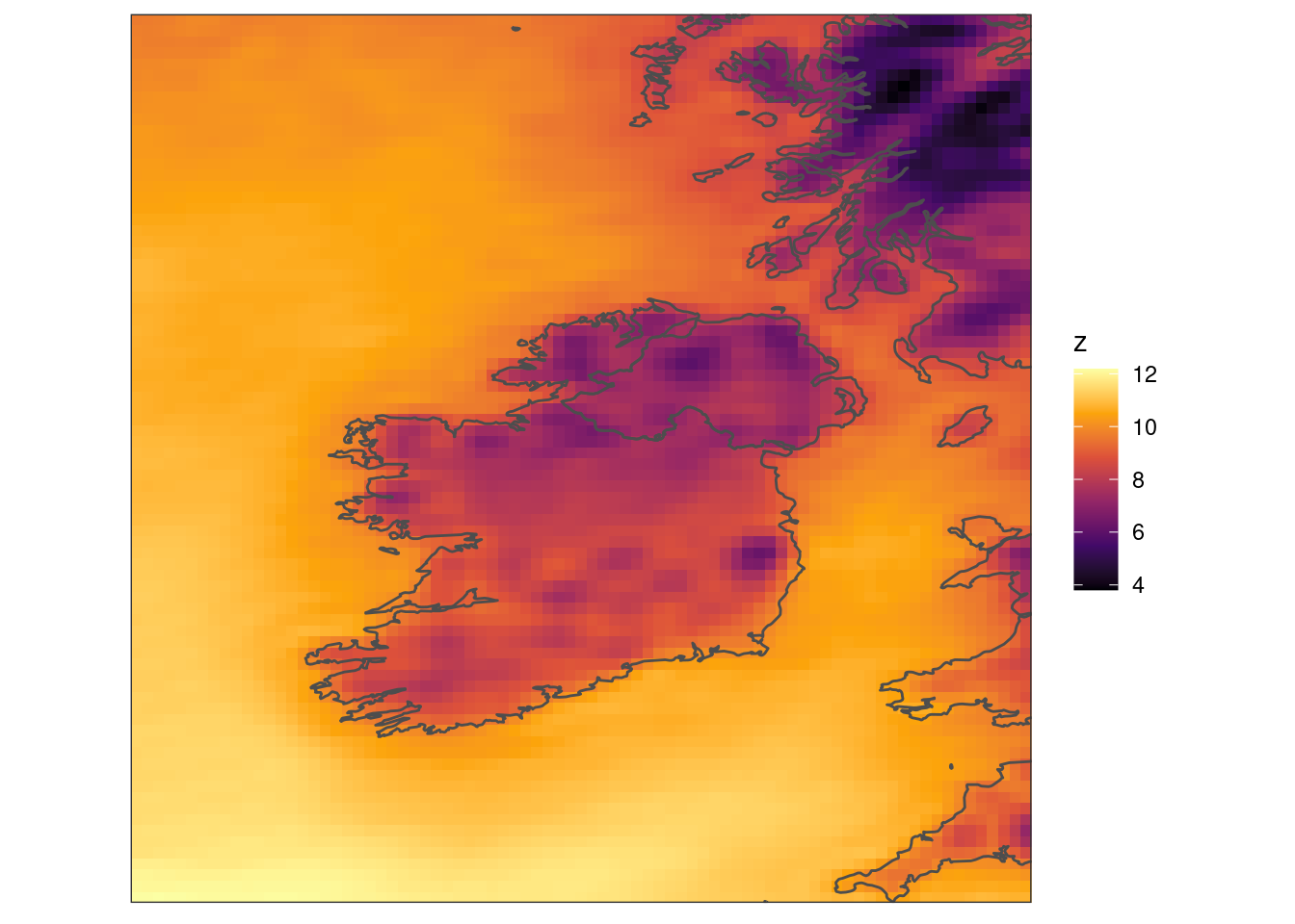
ggplot() +
  geom_georaster(aes(geofield = fcst), tt) +
  geom_path(aes(x, y), map, colour = "grey30") +
  scale_fill_distiller(palette = "PuBuGn") +
  coord_equal(expand = FALSE) +
  theme_harp_map()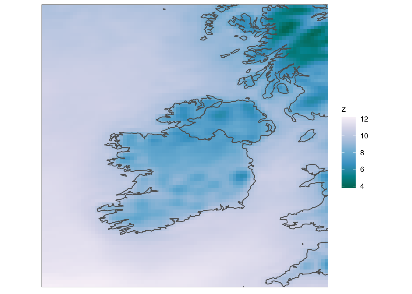
ggplot() +
  geom_georaster(aes(geofield = fcst), tt) +
  geom_path(aes(x, y), map, colour = "grey30") +
  scale_fill_scico(palette = "hawaii", direction = -1) +
  coord_equal(expand = FALSE) +
  theme_harp_map()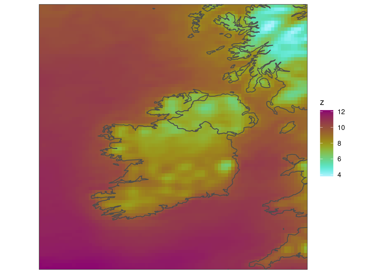
As you can see, there are many choices of colour schemes. You could also bin the colours.
ggplot() +
  geom_georaster(aes(geofield = fcst), tt) +
  geom_path(aes(x, y), map, colour = "grey30") +
  scale_fill_steps(low = "white", high = "darkred", breaks = seq(4, 12)) +
  coord_equal(expand = FALSE) +
  theme_harp_map()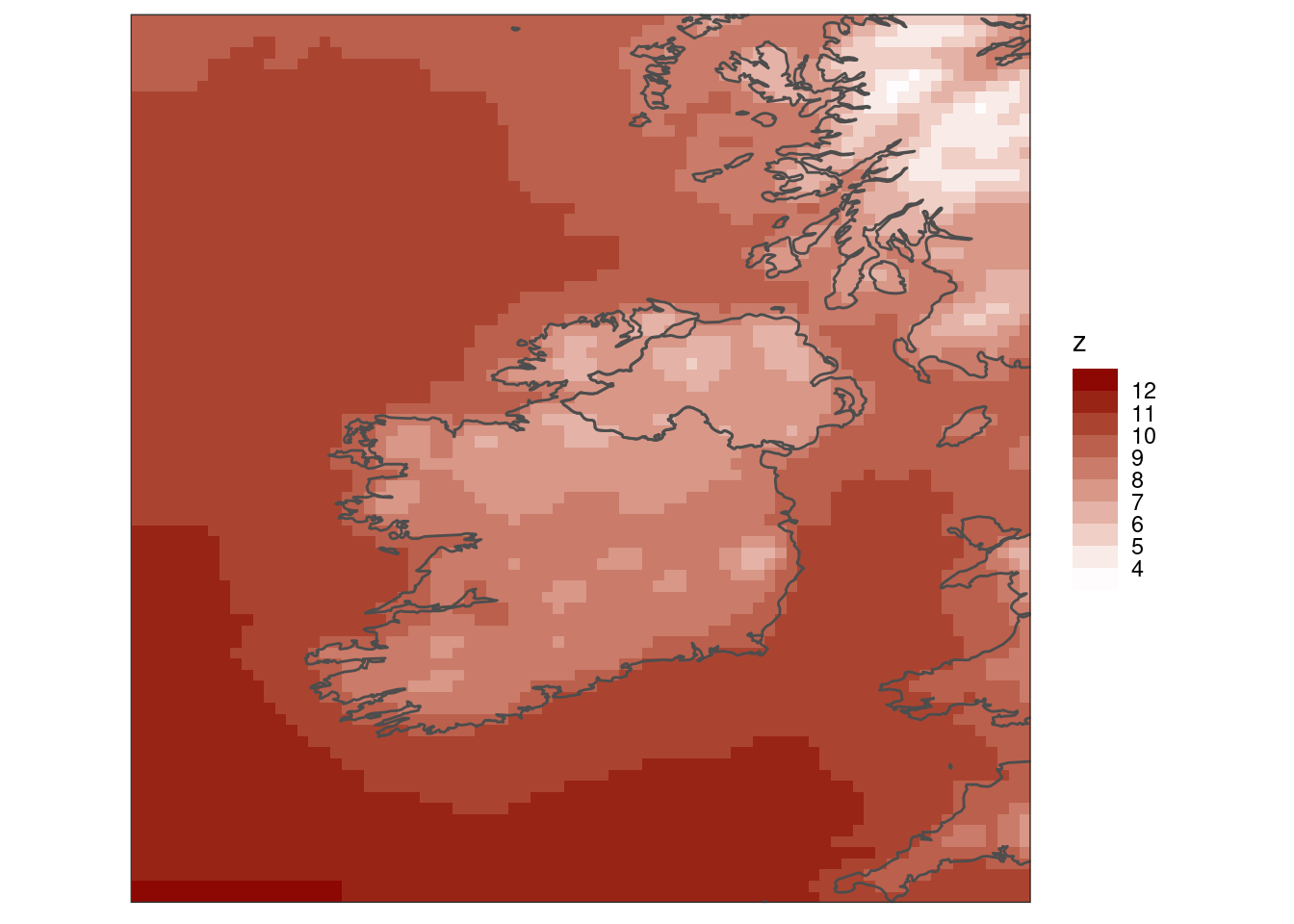
A final thing you might want to do is add a more meaningful title for the legend - it’s always z due to how the geom functions turn the geofield data into a data frame.
ggplot() +
  geom_georaster(aes(geofield = fcst), tt) +
  geom_path(aes(x, y), map, colour = "grey30") +
  scale_fill_binned(
    low    = "seagreen3",
    high   = "yellow",
    breaks = seq(4, 12)
  ) +
  labs(fill = bquote("["*degree*C*"]")) +
  coord_equal(expand = FALSE) +
  theme_harp_map()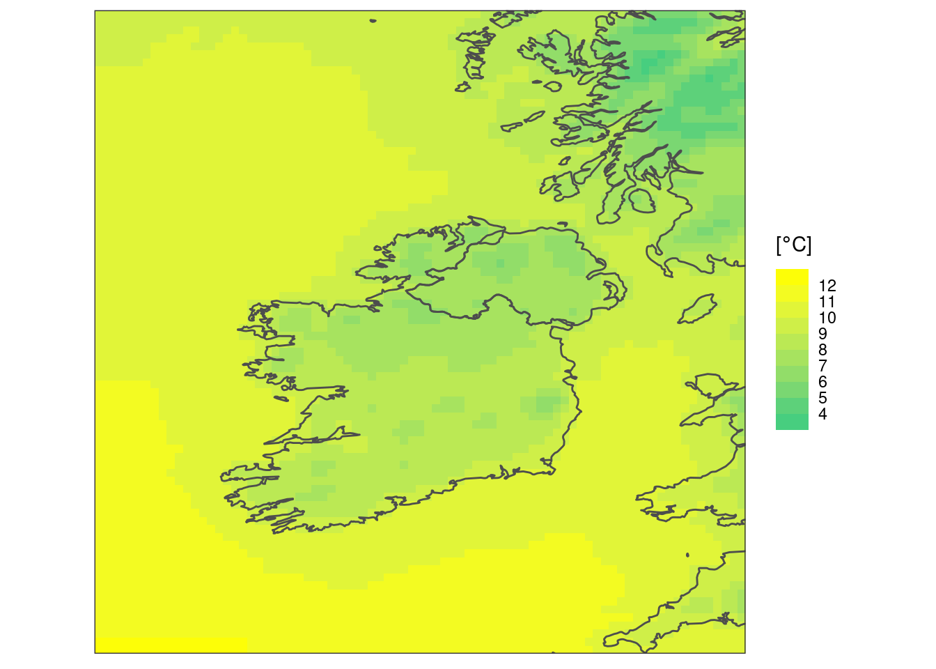
We can now bring all of our data back and make a faceted plot
ggplot() +
  geom_georaster(aes(geofield = ifsens_mbr000), t2m) +
  geom_path(aes(x, y), map, colour = "grey30") +
  scale_fill_binned(
    low    = "seagreen3",
    high   = "yellow",
    breaks = seq(4, 12)
  ) +
  facet_wrap(~valid_dttm) +
  labs(fill = bquote("["*degree*C*"]")) +
  coord_equal(expand = FALSE) +
  theme_harp_map()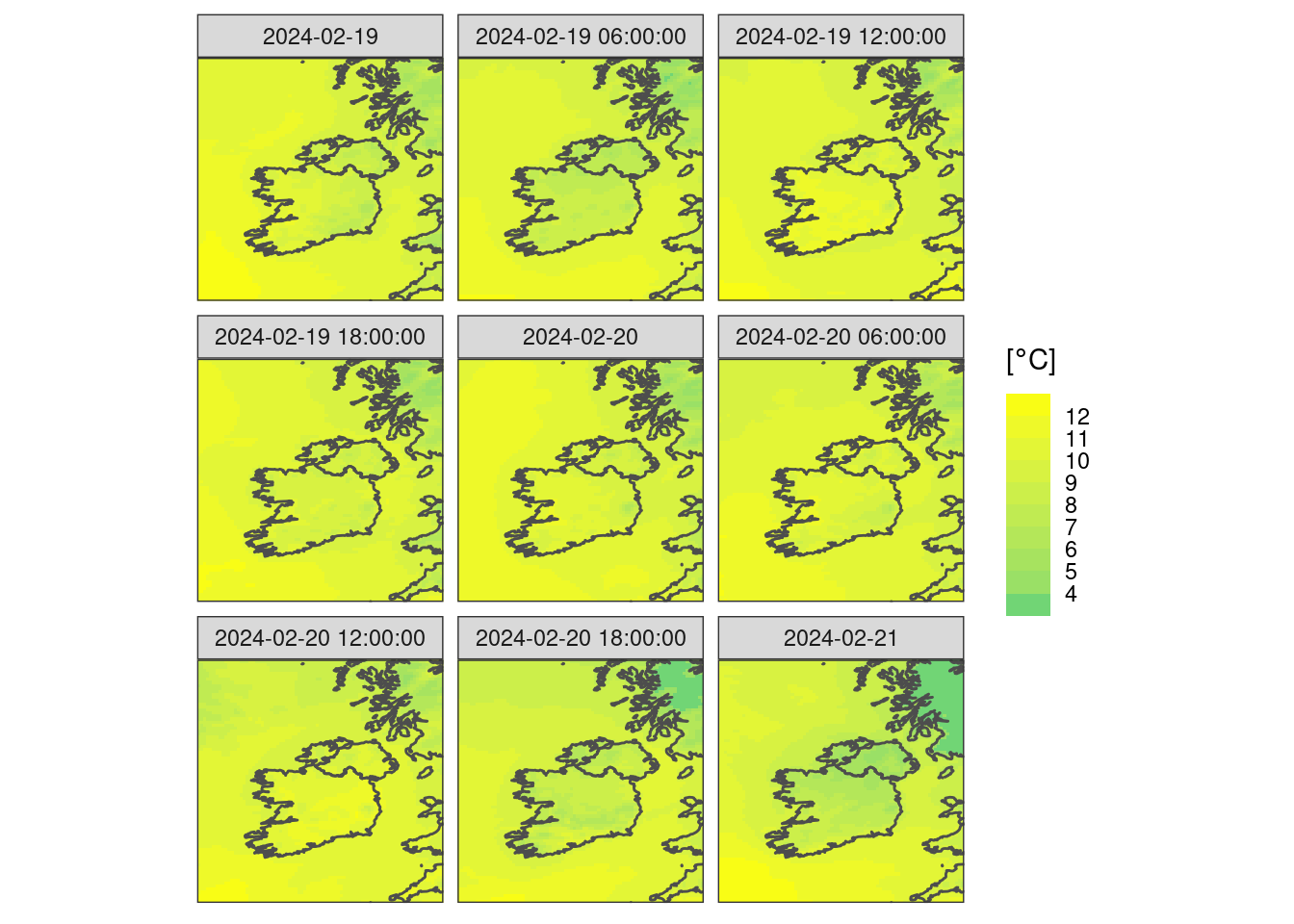
There are maybe some other techniques we would use for other parameters. We might want to show an anomaly, like for example the difference of a member from the control.
ggplot() +
  geom_georaster(aes(geofield = ifsens_mbr001 - ifsens_mbr000), t2m) +
  geom_path(aes(x, y), map, colour = "grey30") +
  scale_fill_gradient2(midpoint = 0) +
  facet_wrap(~fct_reorder(paste0("T + ", lead_time, "h"), lead_time)) +
  labs(fill = bquote("["*degree*C*"]")) +
  coord_equal(expand = FALSE) +
  theme_harp_map()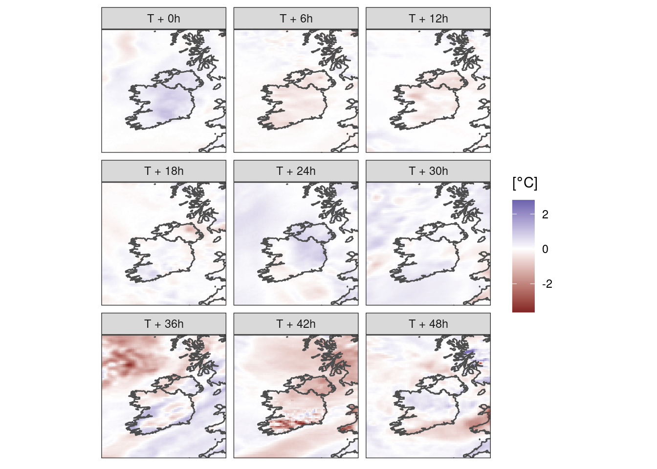
You may also want to do something different with cloud cover…
tcc <- read_forecast(
  20240219,
  "ifsens",
  "tcc",
  members          = 0,
  file_path        = here("data", "netcdf", "ifsens"),
  file_template    = "ifsens_20240219T000000Z.nc",
  file_format_opts = opts,
  return_data      = TRUE
) |>
  as_det()
First experiment with what’s there for one lead time…
ggplot() +
  geom_georaster(aes(geofield = fcst), tcc[1, ]) +
  geom_path(aes(x, y), map, colour = "yellow") +
  scale_fill_gradient(low = "white", high = "grey40") +
  labs(fill = "Cloud fraction") +
  coord_equal(expand = FALSE) +
  theme_harp_map()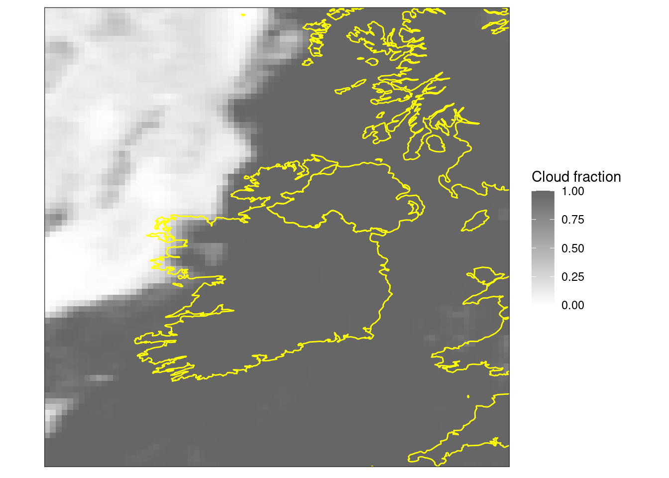
Maybe it would be better in bins of oktas -
ggplot() +
  geom_georaster(
    aes(geofield = fcst),
    mutate(tcc, fcst = round(fcst * 8))[1, ]
  ) +
  geom_path(aes(x, y), map, colour = "yellow") +
  scale_fill_stepsn(
    colours = c("transparent", rev(grey.colors(7))),
    breaks = seq(0, 8)
  ) +
  labs(fill = "Cloud Cover\n[Oktas]") +
  coord_equal(expand = FALSE) +
  theme_harp_map()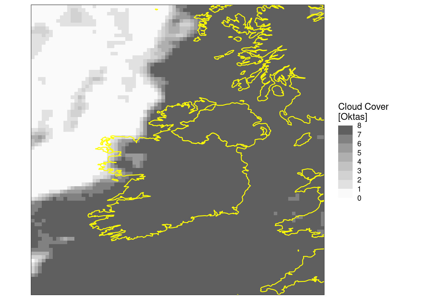
Again, once we’ve got things how we want them we can do the faceted plot
ggplot() +
  geom_georaster(
    aes(geofield = fcst),
    mutate(tcc, fcst = round(fcst * 8))
  ) +
  geom_path(aes(x, y), map, colour = "yellow") +
  facet_wrap(~format(valid_dttm, "%H:%M %a %d %b %Y")) +
  scale_fill_stepsn(
    colours = c("transparent", rev(grey.colors(7))),
    breaks = seq(0, 8)
  ) +
  labs(fill = "Cloud Cover\n[Oktas]") +
  coord_equal(expand = FALSE) +
  theme_harp_map()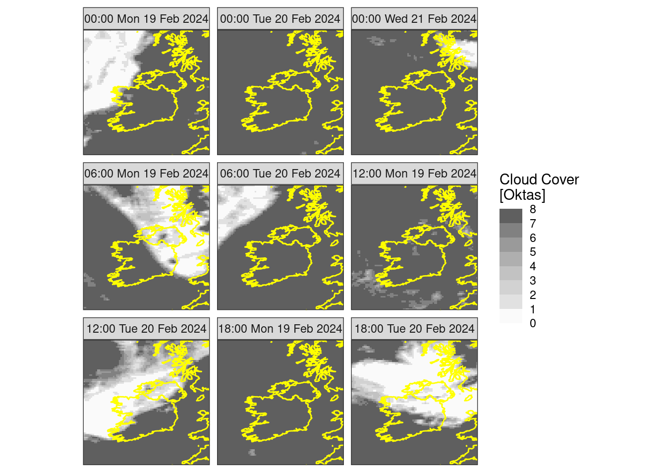
You may also want to do something different with precipitation…
pcp <- read_forecast(
  20240219,
  "ifsens",
  "pcp",
  file_path        = here("data", "netcdf", "ifsens"),
  file_template    = "ifsens_20240219T000000Z.nc",
  file_format_opts = opts,
  return_data      = TRUE
) |>
  decum(6) |>
  filter(lead_time > 0) |>
  scale_param(1000, "kg/m^2", mult = TRUE)
First experiment with what’s there for one lead time…
ggplot() +
  geom_georaster(aes(geofield = ifsens_mbr000), pcp[1, ]) +
  geom_path(aes(x, y), map, colour = "grey30") +
  scale_fill_gradientn(
    colours = scico(256, palette = "oslo", direction = -1)
  ) +
  labs(fill = "6h Precip\n[mm]") +
  coord_equal(expand = FALSE) +
  theme_harp_map()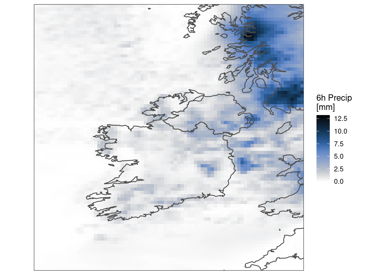
Maybe it would be better with a logarithmic colour scale
ggplot() +
  geom_georaster(aes(geofield = ifsens_mbr000), pcp[1, ]) +
  geom_path(aes(x, y), map, colour = "grey30") +
  scale_fill_gradientn(
    colours  = scico(256, palette = "oslo", direction = -1, begin = 0.2),
    trans    = "log",
    na.value = "transparent",
    breaks   = seq_double(0.125, 8),
    limits   = c(0.125, NA)
  ) +
  labs(fill = "6h Precip\n[mm]") +
  coord_equal(expand = FALSE) +
  theme_harp_map()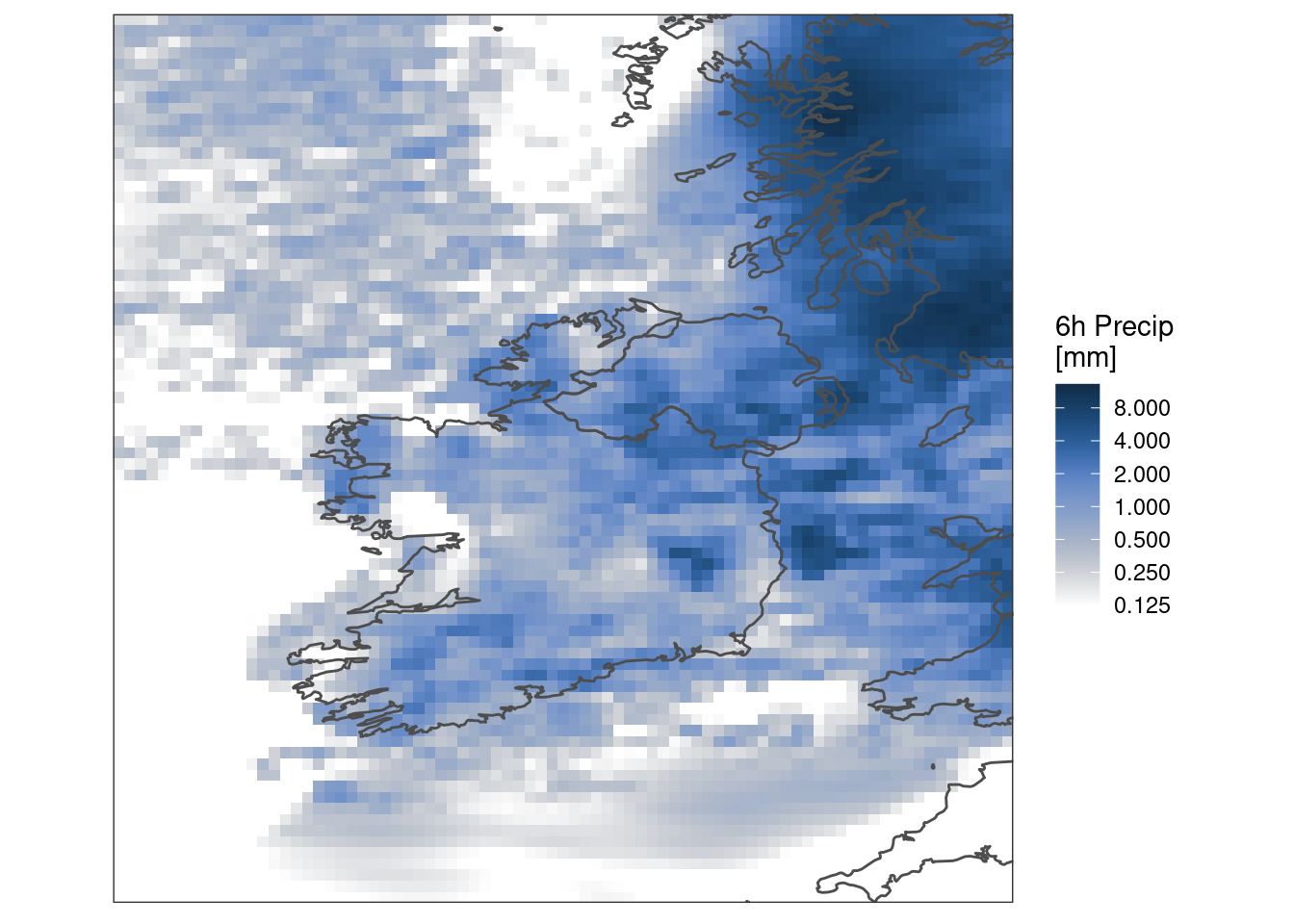
And perhaps better still with some colour bands
ggplot() +
  geom_georaster(aes(geofield = ifsens_mbr000), pcp[1, ]) +
  geom_path(aes(x, y), map, colour = "grey30") +
  scale_fill_stepsn(
    colours  = scico(256, palette = "oslo", direction = -1, begin = 0.2),
    trans    = "log",
    na.value = "transparent",
    breaks   = seq_double(0.125, 8),
    limits   = c(0.125, NA),
    oob      = scales::censor
  ) +
  labs(fill = "6h Precip\n[mm]") +
  coord_equal(expand = FALSE) +
  theme_harp_map()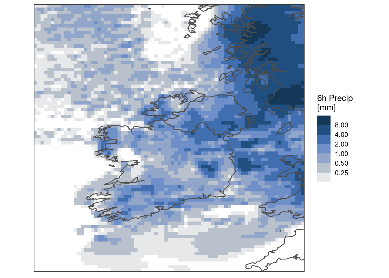
Again, once we’ve got things how we want them we can do the faceted plot. However, this time let’s plot each member for a specific lead time. To do this we need to get all members into a single column. We can achieve that with pivot_members().
ggplot() +
  geom_georaster(
    aes(geofield = fcst),
    filter(pivot_members(pcp), lead_time == 24)
  ) +
  geom_path(aes(x, y), map, colour = "grey30") +
  scale_fill_stepsn(
    colours  = scico(256, palette = "oslo", direction = -1, begin = 0.2),
    trans    = "log",
    na.value = "transparent",
    breaks   = seq_double(0.125, 8),
    limits   = c(0.125, NA),
    oob      = scales::censor
  ) +
  facet_wrap(~member) +
  labs(fill = "6h Precip\n[mm]") +
  coord_equal(expand = FALSE) +
  theme_harp_map()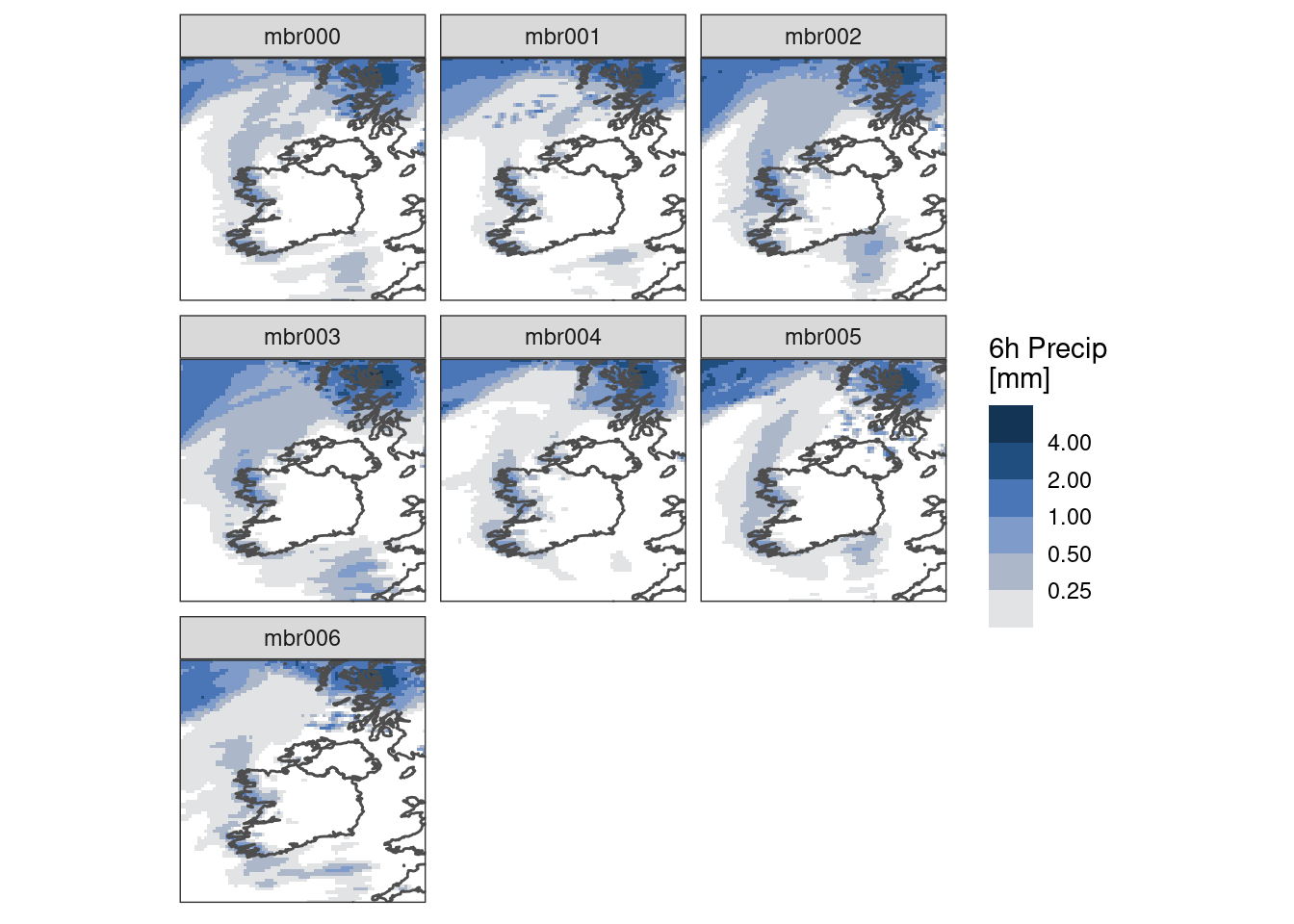
Or, you could go really crazy(!) and plot each member for each lead time
ggplot() +
  geom_georaster(
    aes(geofield = fcst),
    pivot_members(pcp)
  ) +
  geom_path(aes(x, y), map, colour = "grey30") +
  scale_fill_stepsn(
    colours  = scico(256, palette = "oslo", direction = -1, begin = 0.2),
    trans    = "log",
    na.value = "transparent",
    breaks   = seq_double(0.125, 8),
    limits   = c(0.125, NA),
    oob      = scales::censor
  ) +
  facet_grid(rows = vars(lead_time), cols = vars(member)) +
  labs(fill = "6h Precip\n[mm]") +
  coord_equal(expand = FALSE) +
  theme_harp_map()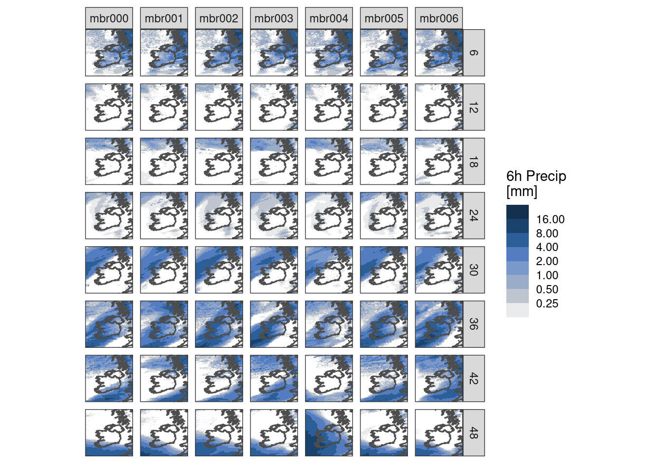
High spatial resolution data
High resolution plots can be quite slow - let’s read some high resolution data from MET Norway’s thredds server (here we have to tell read_forecast() that the file format is NetCDF)
hires_pcp <- read_analysis(
  seq_dttm(2023090415, 2023090423, "1h"),
  "met_analysis",
  "precipitation_amount",
  file_path        = "https://thredds.met.no/thredds/dodsC/metpparchive",
  file_template    = "{YYYY}/{MM}/{DD}/{fcst_model}_1_0km_nordic_{YYYY}{MM}{DD}T{HH}Z.nc",
  file_format      = "netcdf",
  file_format_opts = netcdf_opts(proj4_var = "projection_lcc")
)

map <- get_map(hires_pcp, col = anl)
Just plotting a single geofield with ggplot() is slow.
brks <- seq_double(0.125, 10)

censor_low_squish_high <- function(x, range = c(0, 1), only.finite = TRUE) {
  force(range)
  finite <- if (only.finite)
      is.finite(x)
  else TRUE
  x[finite & x < range[1]] <- NA_real_
  x[finite & x > range[2]] <- range[2]
  x
}

ggplot() +
  geom_polygon(aes(x, y, group = group), map, fill = "seagreen3") +
  geom_georaster(aes(geofield = anl), hires_pcp[1, ]) +
  geom_polygon(
    aes(x, y, group = group), map, colour = "grey30", fill = "transparent"
  ) +
  scale_fill_stepsn(
    "mm",
    colours  = scico(256, palette = "oslo", direction = -1, begin = 0.2),
    trans    = "log",
    na.value = "transparent",
    breaks   = brks,
    limits   = c(0.125, max(brks)),
    oob      = censor_low_squish_high
  ) +
  coord_equal(expand = FALSE) +
  theme_harp_map()
So we have ways of speeding this up - the simplest is downsampling. This basically skips pixels when plotting - and given the resolution these are likely pixels you cannot see anyway. We do this by applying an upscale factor and using "downsample" as the upscale method.
ggplot() +
  geom_polygon(aes(x, y, group = group), map, fill = "seagreen3") +
  geom_georaster(
    aes(geofield = anl), hires_pcp[1, ],
    upscale_factor = 4, upscale_method = "downsample"
  ) +
  geom_polygon(
    aes(x, y, group = group), map, colour = "grey30", fill = "transparent"
  ) +
  scale_fill_stepsn(
    "mm",
    colours  = scico(256, palette = "oslo", direction = -1, begin = 0.2),
    trans    = "log",
    na.value = "transparent",
    breaks   = brks,
    limits   = c(0.125, max(brks)),
    oob      = censor_low_squish_high
  ) +
  coord_equal(expand = FALSE) +
  theme_harp_map()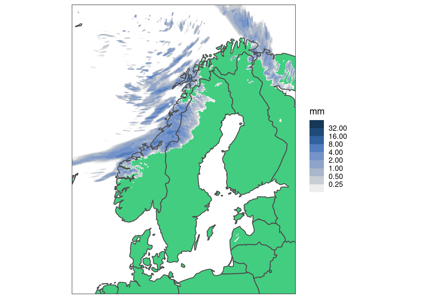
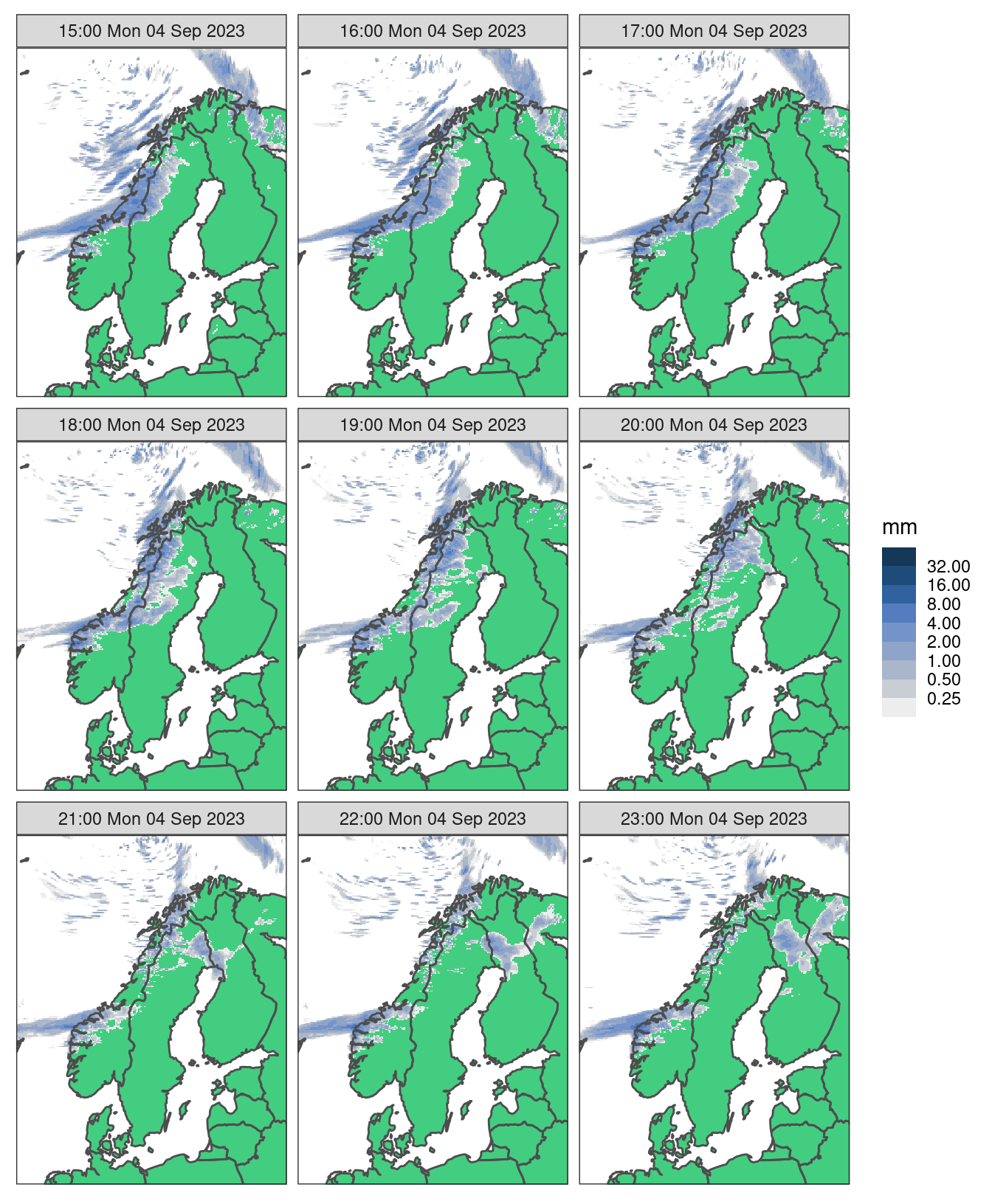
And when we facet, the plots are even smaller so we can get away with a higher upscale_factor
ggplot() +
  geom_polygon(aes(x, y, group = group), map, fill = "seagreen3") +
  geom_georaster(
    aes(geofield = anl), hires_pcp,
    upscale_factor = 8, upscale_method = "downsample"
  ) +
  geom_polygon(
    aes(x, y, group = group), map, colour = "grey30", fill = "transparent"
  ) +
  scale_fill_stepsn(
    "mm",
    colours  = scico(256, palette = "oslo", direction = -1, begin = 0.2),
    trans    = "log",
    na.value = "transparent",
    breaks   = brks,
    limits   = c(0.125, max(brks)),
    oob      = censor_low_squish_high
  ) +
  facet_wrap(~fct_reorder(format(valid_dttm, "%H:%M %a %d %b %Y"), valid_dttm)) +
  coord_equal(expand = FALSE) +
  theme_harp_map()